Maia
Maia is a women's activewear brand based in Shanghai that launched in 2016. I worked with the founder and creative director of the collection on executing her vision. Below was my favorite concept of the three different directions I presented.
Logo & Color Palette
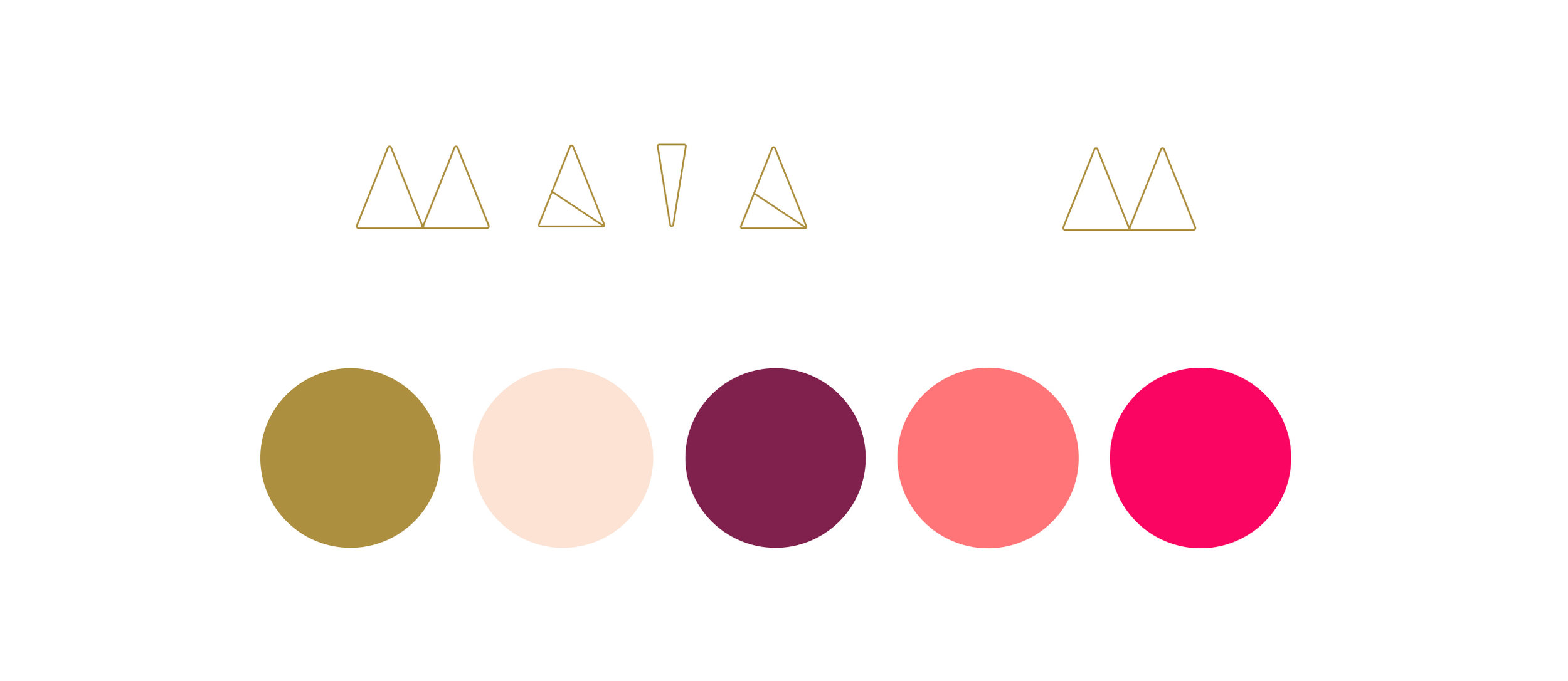
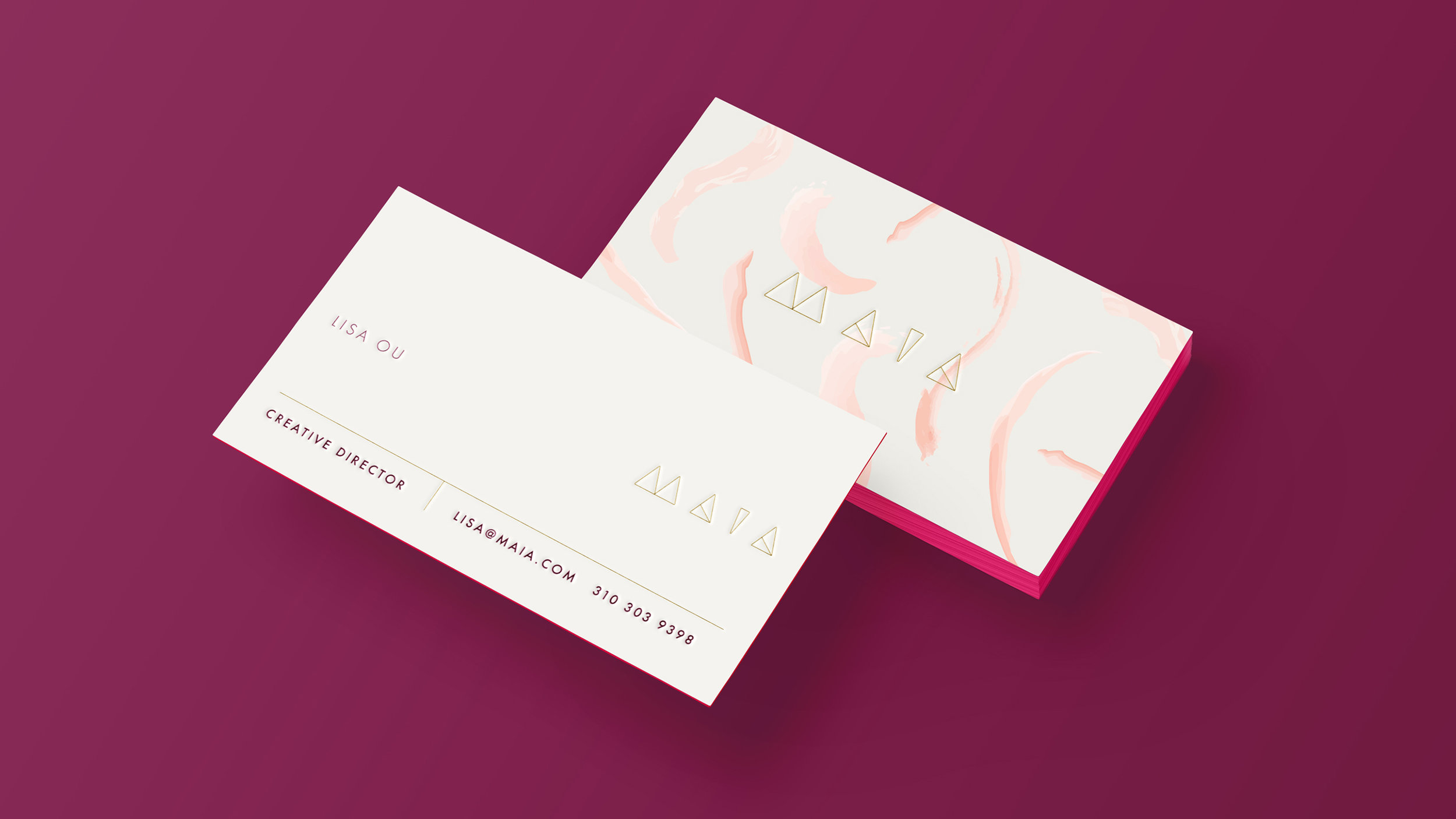
This logo was developed using a series of triangles; a symbol that is incredibly powerful and meaningful in the world of yoga. We selected soft feminine colors and supplemented the color palette with stronger vibrant pinks that speak to a women's active lifestyle.
Pattern
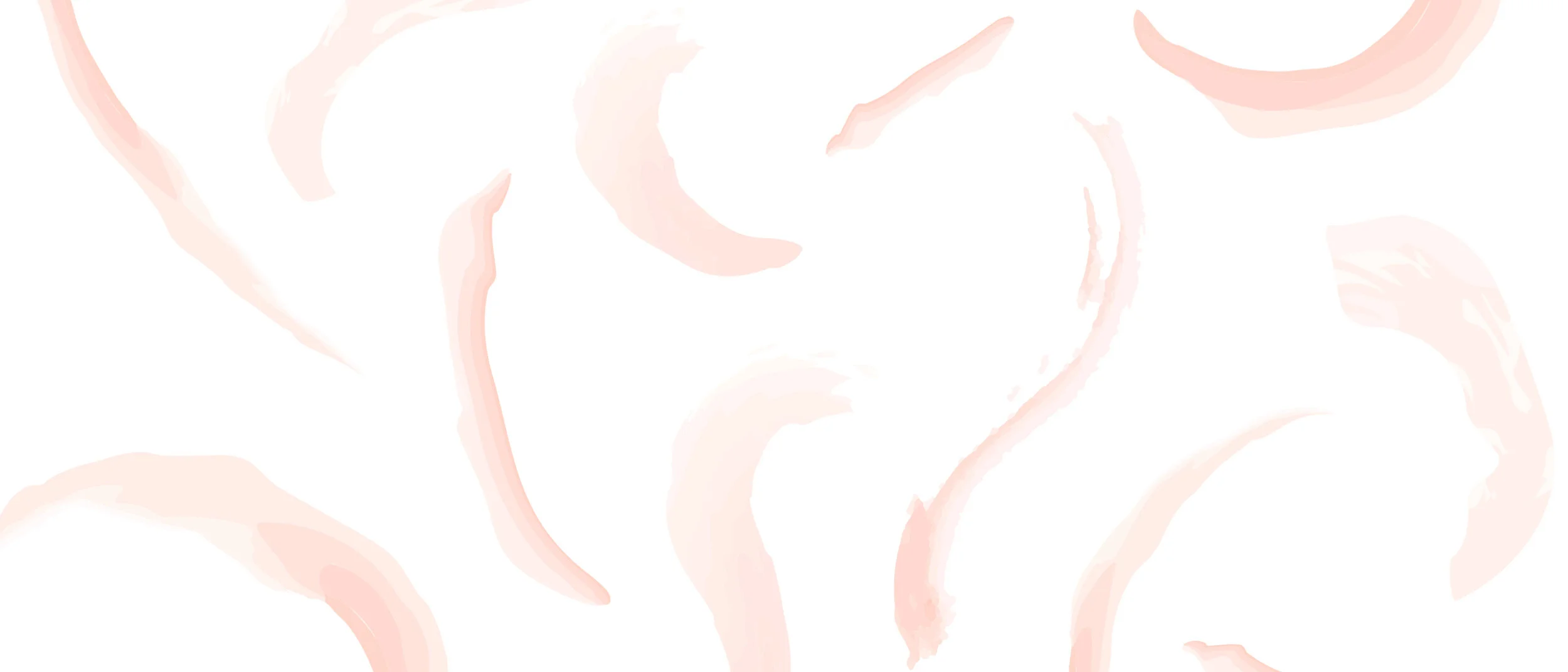
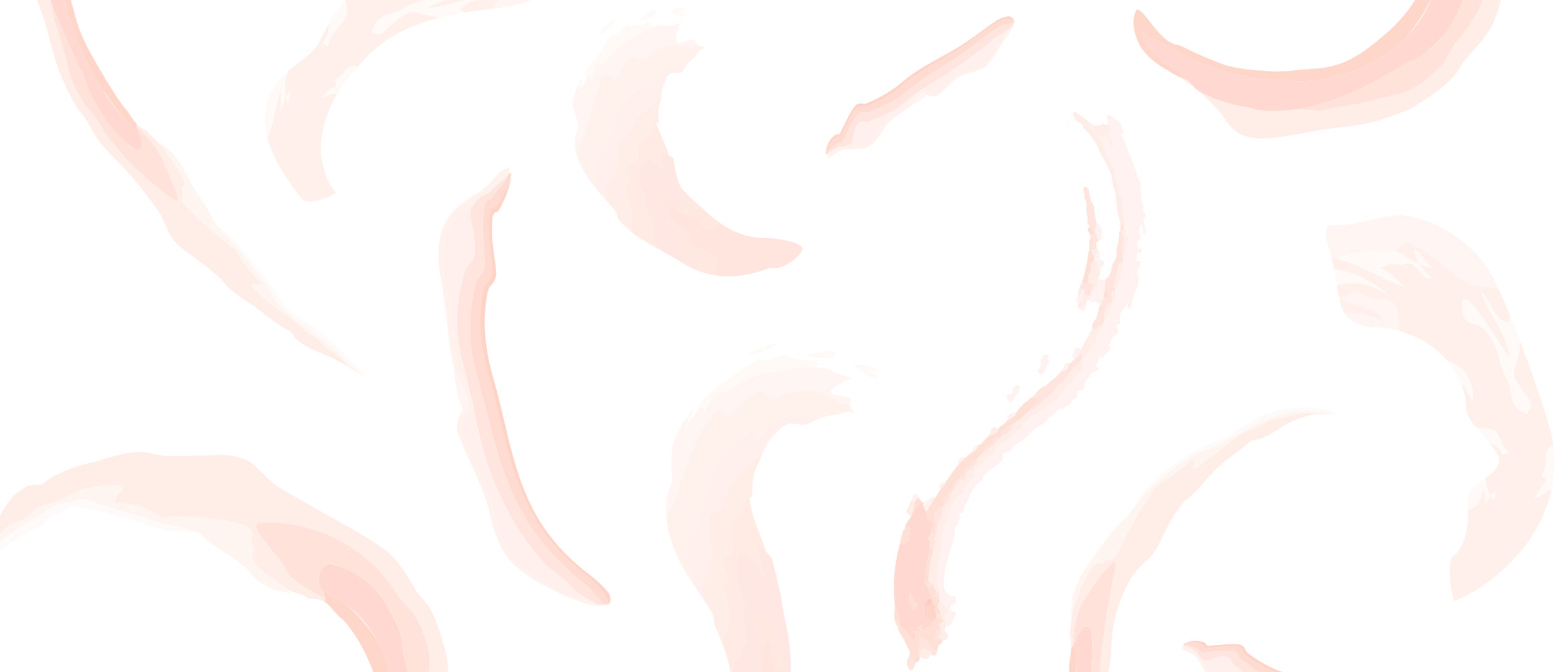
Brush strokes were explored as a pattern that could be used as a core part of the branding or as a seasonal element that is used in the collection and as part of store promotion and marketing. Here it is rolled out as part of the branding however we see the opportunity to continuously switch out the signature pattern that encapsulates the inspiration that season. The brush stroke pattern here represents the movement of the body during yoga.
Packaging
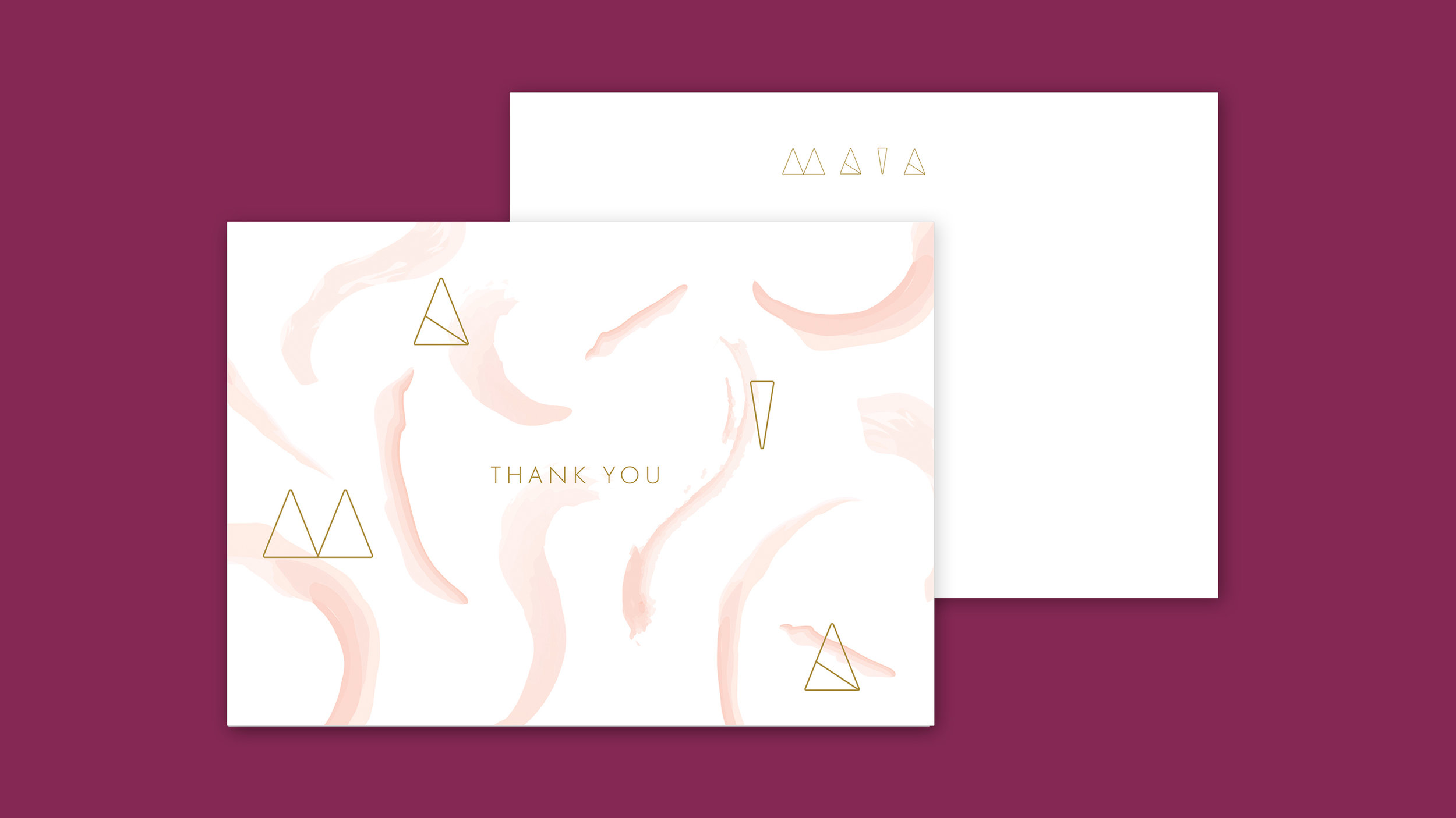
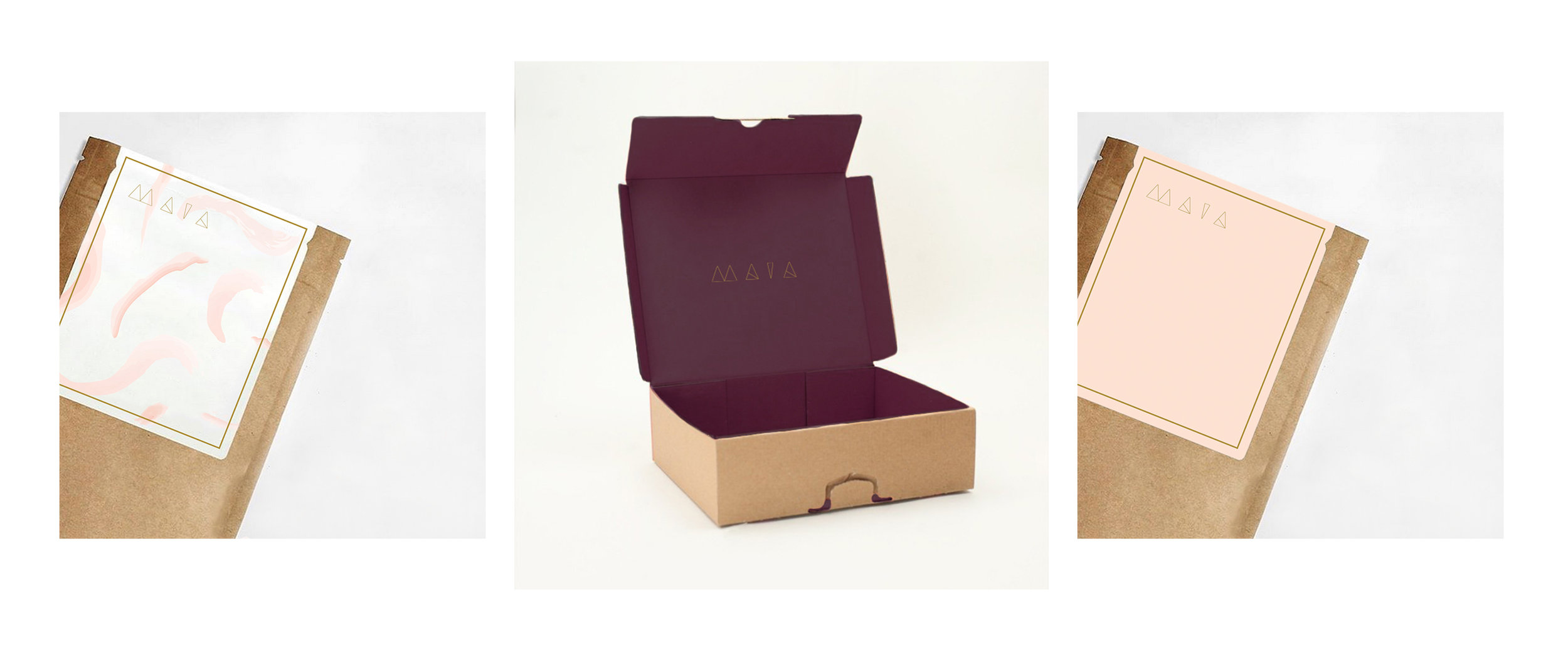
Packaging is an important aspect of the brand as the collection is sold online direct to consumer allowing full control of the buyer's experience. Above is a sample of small and large packaging and below is a flat note thank you card that is included in the shipment.
